The complete guide to creating memorable, consistent brand identity with AI assistance
You finally shipped your Lovable app. It works. Users can click things. Data flows. But when you look at it... it looks like every other Lovable app out there. Same Inter font. Same purple gradients. Same "AI-generated" energy.
Here's the truth: Your brand is what separates "another Lovable project" from "a real product people remember."
This guide shows you exactly how to brand your Lovable app with a complete design system—and more importantly, how to make Lovable remember it forever.
Why Most Lovable Apps Look The Same
Lovable is brilliant at generating working code. But without direction, it defaults to safe choices:
- Inter font (because everyone uses it)
- Purple/blue gradients (the AI aesthetic)
- Soft rounded corners (inoffensive)
- Generic card layouts (predictable)
None of these are wrong. They're just... forgettable.
Brand isn't decoration—it's differentiation. A strong visual identity makes your app feel like a product, not a prototype.
Step 1: Choose Your Aesthetic Direction
Before touching Lovable, spend 10 minutes answering:
- Who is this for? (Be specific)
- What should they FEEL? (Excited? Calm? Empowered?)
- What makes this memorable? (One strong direction beats five weak ones)
Here are four different directions to inspire you:
| Direction | Primary Color | Font Stack | Signature Effect | Best For |
|---|---|---|---|---|
| Punk Rock | Electric Yellow | Anton + Space Grotesk | Hard shadows, tilts | Bold SaaS, creative tools |
| Clean Minimal | Slate Blue | Inter | Soft shadows, white space | Productivity, B2B |
| Playful Fun | Coral + Teal | Poppins + DM Sans | Rounded corners, bouncy | Consumer apps, kids |
| Elegant Luxury | Gold + Black | Playfair Display + Lato | Thin borders, serif accents | Premium products, fashion |
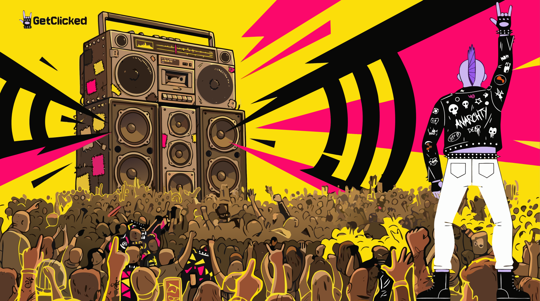
💡 Did You Know: GetClicked uses the "Punk Rock" direction—electric yellow (#FFD000), Anton headlines, hard shadows, and tilted cards. It's memorable because it commits fully to ONE aesthetic.
Step 2: The 3-Part Brand System
Every strong brand has three layers:
Layer 1: Colors
- Primary: Your main brand color (CTAs, highlights)
- Accent: Secondary attention-grabber (badges, featured items)
- Semantic: Success (green), warning (yellow), error (red), info (blue)
- Neutrals: Background, foreground, muted surfaces
Layer 2: Typography
- Display: Big headlines only (1 font, bold statement)
- Heading: H2-H6 and UI labels (workhorse font)
- Body: Paragraphs and descriptions (readable)
- Code: Technical content and code blocks (monospace)
Layer 3: Signature Effects
This is what makes your app uniquely yours:
- Shadows (soft blur vs hard offset vs none)
- Borders (thick vs thin vs none)
- Corners (sharp vs rounded vs pill)
- Motion (subtle vs bouncy vs dramatic)
- Textures (clean vs grunge vs gradient)
Step 3: The Master Design System Prompt
Instead of prompting piece by piece, use this comprehensive prompt to generate your entire design system in one shot:
Brand Personality: [describe in 3-4 words, e.g., 'bold, rebellious, energetic' or 'calm, professional, trustworthy']
Colors:
- Primary: [hex code] - for CTAs, highlights, key interactive elements
- Accent: [hex code] - for badges, featured items, attention-grabbers
- Background: [light/dark preference]
- Include semantic colors: success (green), warning (yellow), error (red), info (blue)
Typography:
- Display font: [font name] for H1 headlines only
- Heading font: [font name] for H2-H6 and UI labels
- Body font: [font name] for paragraphs
- Code font: [mono font] for code blocks
Signature Effects:
- Shadows: [describe - e.g., 'hard 4px offset with no blur' or 'soft subtle blur']
- Borders: [describe - e.g., 'thick 4px solid' or 'thin 1px']
- Corners: [sharp/rounded/pill]
- Special: [any unique effects - tilts, textures, animations]
Implementation:
- Add all colors as HSL CSS custom properties in index.css (both light and dark mode)
- Configure the complete Tailwind theme in tailwind.config.ts
- Create a designSystem.ts file documenting all design decisions
- Generate a markdown summary of the entire design system I can save to Project Knowledge"
Customize the prompts above with your specific choices and run.
Step 4: Save Your Style to Lovable's Memory
This is the most important step most builders skip.
Without saving your design system to Project Knowledge, Lovable forgets your brand choices with every new conversation. You'll constantly fight to maintain consistency.
Here's how to fix that forever:
After generating your design system, ask Lovable:
- All color values with usage guidelines
- Typography rules (which font for what)
- Component styling rules (shadows, borders, corners)
- Voice and tone guidelines
- AI decision rules for consistent choices
Format it so another AI reading this would know exactly how to style new components."
Copy the generated markdown
Go to Settings → Manage Knowledge in your Lovable project
Paste the design system markdown and save
Saving your design system to Project Knowledge is the difference between "branding once" and "branding forever." Every future component Lovable generates will now respect your brand automatically.
Step 5: Define Your Voice and Tone
Brand isn't just visual—it's verbal. How does your app talk to users?
Personality: [3-4 words, e.g., 'direct, friendly, encouraging']
Tone: [formal/casual/energetic/calm]
Writing Style:
- DO use: [e.g., contractions, second person 'you', short sentences, questions]
- AVOID: [e.g., corporate jargon, passive voice, apologetic tone, buzzwords]
Example Phrases:
- Instead of 'Your request has been submitted' → '[your version]'
- Instead of 'An error has occurred' → '[your version]'
Add this to the voice section of the design system and include it in the Project Knowledge export."
Voice Examples by Brand Type
| Brand Type | Voice | Example Button Text | Example Error |
|---|---|---|---|
| Professional | Clear, confident | "Submit Request" | "Unable to process. Please try again." |
| Friendly | Warm, helpful | "Lets Go!" | "Oops! Something went wrong. Give it another shot?" |
| Rebellious | Direct, bold | "Get Started" | "That didnt work. Try again." |
| Playful | Fun, casual | "Lets Do This!" | "Whoops! Lets try that again." |
Step 6: Create AI Decision Rules
The secret to consistent design: teach Lovable WHEN to use what.
Button Choices:
- Primary (brand color): [when to use - e.g., main CTAs, important actions]
- Secondary: [when to use - e.g., cancel, back, alternative actions]
- Ghost: [when to use - e.g., tertiary actions, navigation]
- Destructive: [when to use - e.g., delete, dangerous actions]
Shadow Choices:
- Large shadow: [when to use - e.g., featured cards, hero elements]
- Medium shadow: [when to use - e.g., standard cards]
- Small shadow: [when to use - e.g., buttons, interactive elements]
Typography Choices:
- Display font: [when to use - e.g., page H1 headlines only]
- Heading font: [when to use - e.g., all other headings, UI labels]
- Body font: [when to use - e.g., paragraphs, descriptions]
Color Meaning:
- Primary color: [meaning - e.g., main actions, brand identity]
- Accent color: [meaning - e.g., featured items, special badges]
- Success green: [meaning]
- Warning yellow: [meaning]
- Error red: [meaning]
- Info blue: [meaning]
Add these rules to the design system so Lovable makes consistent choices automatically."
Individual Component Prompts
Once your system is set, use these prompts for specific elements:
Colors and Theme
- Primary: [hex] as HSL
- Accent: [hex] as HSL
- Background: [light or dark base]
- All semantic colors (success, warning, error, info)
Make sure all components use these CSS variables, not hardcoded colors."
Typography
- Import [display font] from Google Fonts for H1 only
- Import [heading font] for H2-H6 and UI
- Import [body font] for paragraphs
- Import [mono font] for code
Configure font-family CSS variables and apply throughout the app."
Cards and Containers
- Background: [solid color / gradient / transparent]
- Shadow: [describe your signature shadow]
- Border: [thickness and style]
- Corners: [sharp / rounded / specific radius]
- Hover effect: [describe]
Update the base card component to use these as defaults."
Textures and Overlays (Optional)
- Covers the viewport
- Uses [texture type] with [opacity]
- Uses mix-blend-mode for subtle effect
- Is pointer-events: none (doesnt block clicks)
- Applies globally for atmosphere"
Your Complete Brand Checklist
Before prompting Lovable, fill this out:
| Element | Question | Your Answer |
|---|---|---|
| Core emotion | What should users FEEL? | |
| Primary color | Your main brand color (hex) | |
| Accent color | Secondary attention-grabber (hex) | |
| Display font | Big headlines only | |
| Heading font | H2-H6 and UI elements | |
| Body font | Paragraphs and descriptions | |
| Code font | Technical content | |
| Shadow style | Hard offset / soft blur / none | |
| Border style | Thick / thin / none | |
| Corner style | Sharp / rounded / pill | |
| Special effect | What makes it uniquely YOU? | |
| Voice personality | 3-4 words describing tone | |
| Words to use | Your brand language | |
| Words to avoid | What NOT to say | |
| Saved to Knowledge? | Critical for consistency |
Real Example: The GetClicked Brand
Here is how GetClicked implemented this system:
| Element | GetClicked Choice |
|---|---|
| Core emotion | Rebellious energy, punk rock |
| Primary | Hero Yellow #FFD000 |
| Accent | Riot Pink #E63984 |
| Display font | Anton (H1 only) |
| Heading font | Space Grotesk |
| Body font | Inter |
| Shadow style | Hard 4-8px offset, no blur |
| Border style | Thick 4px black |
| Corner style | Sharp (brutalist) |
| Special effects | Tilted cards (-1 to -2 degrees), grunge texture |
| Voice | Rebellious, direct, anti-corporate |
| Words to avoid | "Synergy," "leverage," "unlock potential" |
The result? An app that looks nothing like "generic AI output"—it has genuine personality.
💡 Did You Know: GetClicked's design system is saved to Project Knowledge, so every new feature automatically matches the brand. No more fighting to maintain consistency.
Common Mistakes to Avoid
These mistakes will make your app look generic:
Dont: Use Inter for everything
Do: Pick at least 2 fonts—one for display, one for body
Dont: Default to purple gradients
Do: Choose colors that match your brand emotion
Dont: Skip saving to Project Knowledge
Do: Save your design system so Lovable remembers forever
Dont: Mix multiple aesthetics
Do: Commit fully to ONE direction
Dont: Forget voice and tone
Do: Define how your app talks, not just how it looks
Your Next Steps
Fill out the brand checklist above
Use the Master Design System Prompt to generate your system
Save the exported markdown to Settings → Manage Knowledge
Build with confidence—every new component will match your brand
Your app deserves more than default styling. Give it a brand that people remember.